Initial Ideas
I thought these stickers could be stuck on every promotional material i design. E.g the take away bags, sandwich stickers etc. just to add a bit more fun into the design rather than it being just the logo.

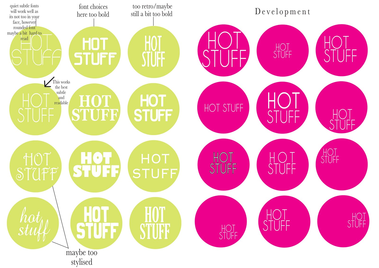
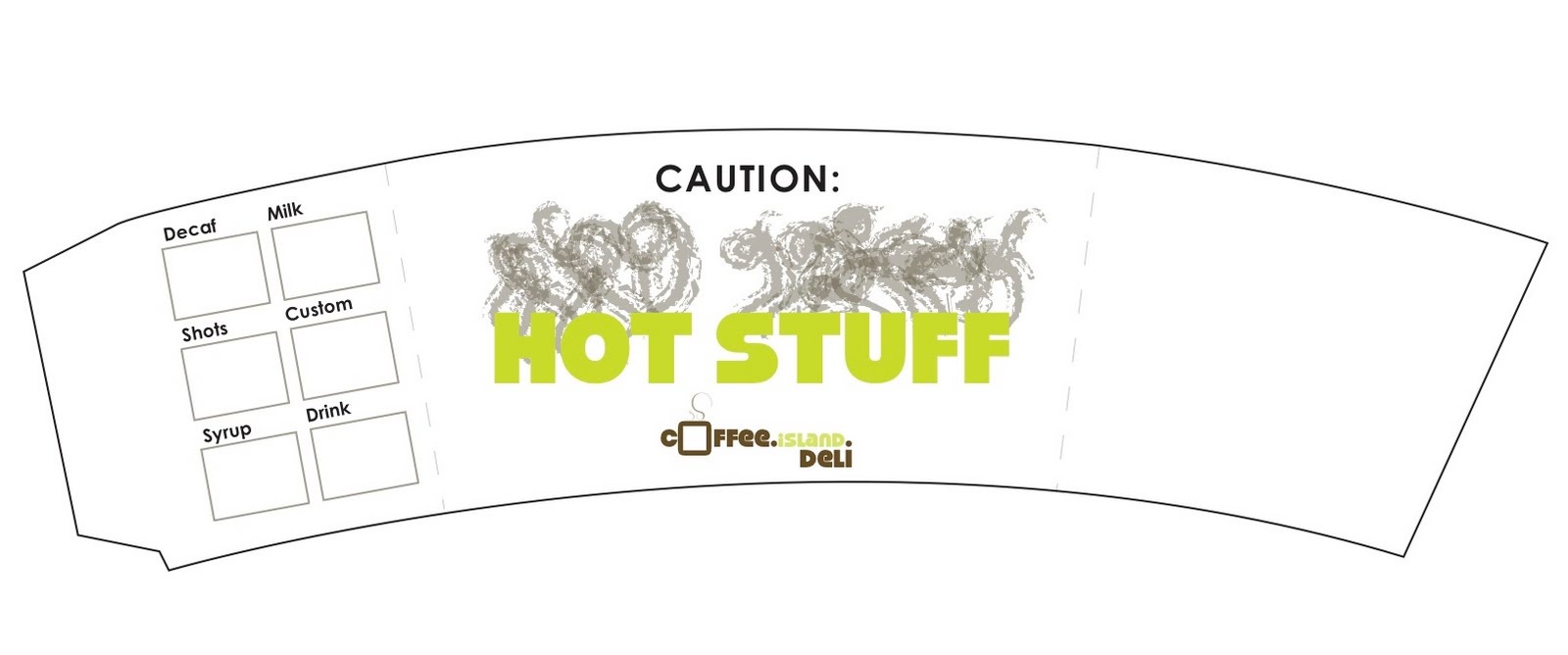
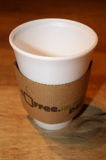
For the cup holder, i have chosen to write 'hot stuff' on it as it refers to what is inside the cup and it is also something a bit quirky and fun as 'hot stuff' could be seen as calling ad attractive person 'hot stuff'!

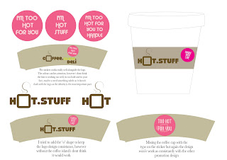
Final Chosen Sticker

I found this was the best sticker as it wasn't too bold. It is center aligned and because i have chosen a condensed font it is not very visible until you go up close to it which is exactly what i want my audience to do, be intrigued about what it says on the sticker.
Development

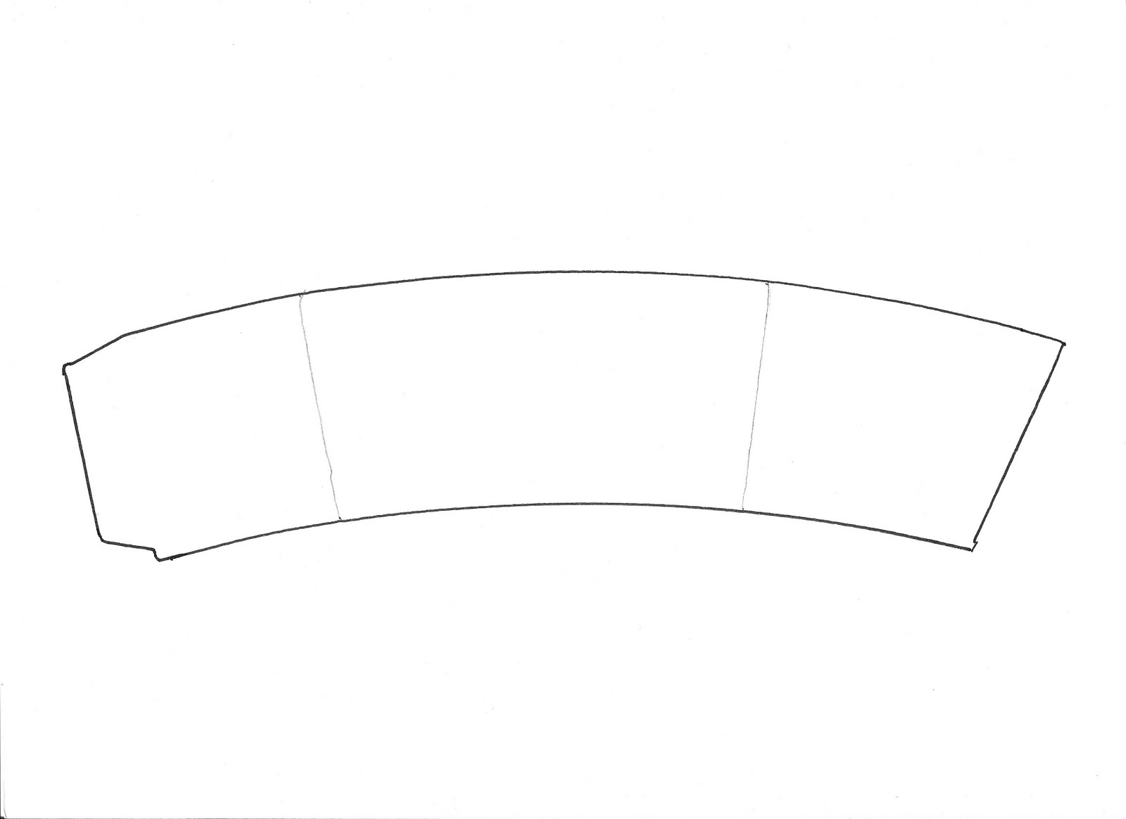
Final Cup Holder

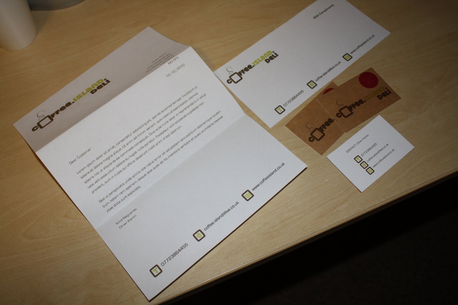
In context

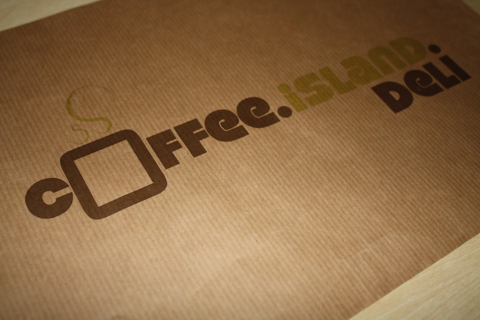
I printed on the brown paper stick which i think works really well. The sticker inst going to be part of the label its going to be a separate stick which gets stuck on the cup and the other promo material. I just tried this to see what the sticker would look like. I think the size of the sticker could benefit from being slightly bigger.
Also the stock is way to thin for this and if this was used im sure coffee island would definately be getting some complaints about burnt fingers! Therefore, i WILL be mounting my design onto some corrugated card which will grip the cup better.
And...Here it is:


.jpg)
.jpg)