Thursday 29 October 2009

Paper stock test


Menu Layout ideas and Development


Paper Mock

The Menu will approximately be 12X12cm but if the information on the menu doesnt fit then the size may need to be altered.
Things i need to consider when i start applying menu info onto the design:
Type needs to be a decent size for people to read
Information needs to be clear in order to be understood properly


Menu Design-Initial ideas


After putting a few ideas down on paper i decided to take idea 2 further. I felt like this design had a strong relation to the logo and also will make the menu look a little different to normal menus.

Colour Change

My client changed the mustard colour to a fresh lime green. I personally think these colours work better as they relate to coffee and deli well.

Here is the final logo:


Here are my corporate identity ideas:

Tonight ive been working on the business card designs for Coffee Island. Here is what i came up with. I will be emailing these ideas over to the client tomorrow.


After pitching these to the client, he said the designs were too much and he preferred something a bit more simpler.

The Beginning..

Over the Summer i went to go visit a client in Salford who had just bought a coffee shop in a very peak location. His shop is located right opposite Salford train station and around him are large offices where business people work.

When i got there i hooked up with a interior designer, a marketing guy and me of course as the graphic designer. [that was wierd typing that]

He is only 26 years of age and he wanted a logo designing which was fresh, new and reflected coffee island to its fullest. He wanted his logo to attract old and new visitors to the coffee shop as the previous owner had good relationships with their customers and he wanted to maintain the standard.

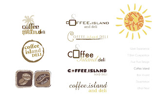
Here is the journey i went on when creating the coffee island logo, From initial ideas to development and final chosen logo. Sinse this design has been done...the colour scheme has changed a bit as i recommended a lime green to compliment the brown rather than the mustard as i think the mustard was too close to the brown.