Wednesday 2 December 2009

FINAL COFFEE ISLAND PROMOTIONS

I feel my photography for the promo material is very dark and i need to re-shoot these on a white background.


Monday 30 November 2009

Preparation for Print

Prepared document for the stickers to be printed out tomorrow.


To use the vinyl cutter, i had to prepare the circles on a seperate document for it to pick up the shape it has to cut out.

Take away Bag


First Test messed up as i was unsure which way the printer would print.


Second test was much better. Logo looked effective one brown stock and i was happy :)


Serviette Pack Design

I thought about the way i could package my serviette rather than printing onto the actual serviette. I thought giving a pack out with a seviette knife, folk and spoon would cover everything they sell at the coffee shop for example, jacket potatoes, soups etc.


Label for the serviette


In context


From this i thought of making the sandwich label in a similar style


Sticker idea to contain information about the sandwich and price


In context

Update on Corporate

Business Card Development


Final Chosen Business Card


Letterhead development


Final Chosen Letterhead


Compliment Slip


Final Chosen Compliment Slip


Complete Corporate Set


Saturday 28 November 2009

Paper test

While i was in a cafe last week. I picked up this serviette. The green recycle logo really stands out on the brown texture. It got me thinking what my design would look like on a brown stock...


..So i tried it! I think it works really well, and stands out!

Wednesday 25 November 2009

Sticker

Initial Ideas


I thought these stickers could be stuck on every promotional material i design. E.g the take away bags, sandwich stickers etc. just to add a bit more fun into the design rather than it being just the logo.


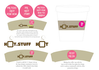
For the cup holder, i have chosen to write 'hot stuff' on it as it refers to what is inside the cup and it is also something a bit quirky and fun as 'hot stuff' could be seen as calling ad attractive person 'hot stuff'!
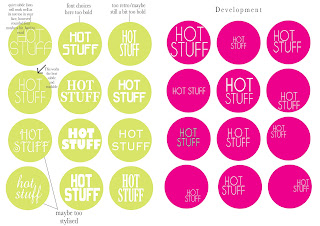

Final Chosen Sticker

I found this was the best sticker as it wasn't too bold. It is center aligned and because i have chosen a condensed font it is not very visible until you go up close to it which is exactly what i want my audience to do, be intrigued about what it says on the sticker.

Development


Final Cup Holder


In context


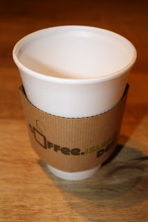
I printed on the brown paper stick which i think works really well. The sticker inst going to be part of the label its going to be a separate stick which gets stuck on the cup and the other promo material. I just tried this to see what the sticker would look like. I think the size of the sticker could benefit from being slightly bigger.

Also the stock is way to thin for this and if this was used im sure coffee island would definately be getting some complaints about burnt fingers! Therefore, i WILL be mounting my design onto some corrugated card which will grip the cup better.

And...Here it is:
Tuesday 17 November 2009

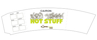
1st cupholder label and test

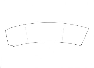
I drew around an existing cup holder to form a basic template for my cupholder.


Evaluation of Test.
After doing this test, i found i needed to use a thicker stock..maybe corrugated card to ensure the holder stays around the cup and doesn't fall off. As far as design is concerned this was a quick test i did just to see how my type would fit on the holder. This design is far too busy and i think it just doesn't work. I need to think about what will make my design stand out from other cup holders. The logo is also getting lost withing the design and my identity is the most important, so this is something i
need to think about.